Wednesday, May 29, 2013

So What is Chroma?


So here I am throwing out lots of “color” words – as if working in glass isn’t hard enough.  Color theory is so important to art – I’d even go so far as to say it’s the “everything” if you are working in color.  If you can’t get a color to work right you will never get the depth you want in your work and it covers just about everything, even jewelry (a subject near and dear to my heart).  See a previous post on thinking about metals as color.
The chroma or saturation of a color is a measure of how intense it is. Think of it as “pure, bright color”. Remember how I mentioned I wanted that creamsicle?  I needed an orange that was a true bright hue.  Then, chemicals willing, when I added a white to it I would get a tint of that orange that looked like a creamsicle.   What happened when I used a variety of oranges is what I photographed.  These are the colors of some the thick stringers I pulled as experiments.  Pretty but not exactly orange.  Depending on whether the orange I chose as my base color was already diluted with a gray or another color greatly influenced the outcome of my color mixing. 
But Aren’t Value and Chroma the Same Thing?
Color mixing would be easier if they were, but they’re not. With chroma you’re considering how pure or intense the hue is, whereas with value you’re not considering what the hue is at all, just how light or dark it is.
And if that weren’t enough to think about how about the word – Chromaticity.  Be sure to use this one is a sentence the next time you see a Jackson Pollack painting.  “Uh, honey – I think the chromaticity of that red in Jack’s painting just makes it, don’t you?” LOL
Chromaticity: Highly chromatic colors contain maximum hue with little or no impurities such as white, black or gray.   The degree to which a color is free from being mixed with other colors is a good indication of its chromaticity.  Often referred to as "colorfulness," chroma is the amount of identifiable hue in a color.

Monday, May 27, 2013

Value/ Tone/ Chroma - Choosing your own color palettes

When I was blogging about finding a color combination I mentioned I wanted a different value of the color orange.   At first I had blogged “tone” – and later when I went to edit the post I realized I meant value.   Talking about tone and value can get very confusing….even to an artist and among artists. 

Let’s see if we can shine a little light on this subject:
According to Faber Birren in his book Principles of Color, and according to most accepted color theory:

"
Value -- the range of light and dark within either neutrals or colors. Black is at one extreme, white at the other.

Tone -- a color mixture that is not pure color hue (such as the highest chroma for a given color), and not black and not white. This mixture is an intermediate (can also be blend of hues - colors). In other words, if you were to take a pure color and add grey, you would have Tone.  And of course, many tones can be made with complementary colors instead of black and white, resulting in the same outcome.

These two terms are quite a bit different, and really have little in common, other than Tone could range up and down on the value scale for a specific Hue."
So long as a Hue is mixed only with white or black, it stays a pure tint or shade (making it a different value of the pure hue – lighter or darker).  Once another color or grey is introduced, it becomes a Tone.
 
This is a quick example of the concept of Tone, as set forth by Faber Birren.

"Cadmium Red Medium as the "Color" (I wish he had used the term "Hue").
At top right is White, and lower right is Black. The range from Black to White is Value, or a “value scale”. This range reflects the grays between the two extremes of value (B&W).

The range from White to Red (in this case -- you can substitute any pure Hue - color) are the Tints.

The range from Black to Red represents the Shades.

The entire central area (the inner triangle) is partially represented as the range of possible Tones, and each has a particular number for its position (not shown here). The range of tones represents all possible variations between the three corners of Red, White and Black."

I hope that helps illustrate Birren's concept a little better.  What I wanted when I was looking for a creamsicle glass was the color (hue) orange at its highest chroma diluted only with white to give me a color that was light in value and would “pop” because I followed the concepts of a color wheel AND yet show up on the colors that were either a dark value or tone.
These principals work in all areas of art despite the medium and design of the art piece.  I always think about this – especially when I am picking out a color combination I might not have worked with before.  If you want someone to notice your work all the great design in the world won’t work if you use the wrong values or tones.  You will wonder why your piece is kind of blah and someone else’s is selling then look at your color choices.  You don’t necessarily need to buy someone’s tutorial on their “color palettes” you can make up your own too.
Most of the color theory information (within the quotes) was transferred from Internet reference sites.

 
These thick stringers were made with some of the oranges I was trying to alter into that elusive creamsicle color.  It was after I went back to my old color theory training that I fully realized what I had done wrong.  The rods of glass I chose to add white to were already "tones" of oranges.  They had all been altered with either a gray or gray+hue to create the color so adding white was unlikely to get me the results I wanted.  I got pretty results none the less - but they're also going to be a glass that is going to need special treatment in the flame.  This is how two of those stringers were used.
 
 
They struck alright, made a very nice light coral color but incredibly hard to control in the flame.


Sunday, May 26, 2013

The Beads of my Tetrad Palette

I've used up most of my stringers and my twisties.  I'm not sure how well this palette might go over with some of my Bead and Button customers so it's time to switch to another one for a few more sets before I have to get my supplies packed up for the classes I'm going to take.  Next time I better look for an orange with a higher chroma to mix with.  The one is used had a chemical quality that made it more a "striking" color than anything else and it didn't always turn up that elusive "creamsicle" color that I wanted.

Oh, I got it here and there but not consistently.  These bead sets will be okay - they could have been better.  I don't like how transparent my purple went on my heart and how the creamsicle changes depending on whether it struck easily or not.  ACK!


Now I'm hungry for one of these.  Next time my color palette isn't going to relate to something yummy to eat!

Saturday, May 25, 2013

Choosing the next glass color scheme...


Finding a pleasing mix of glass colors isn't always easy.  Sometimes finding a color combination can be a downright pain in the butt when you have a main color choice stuck in your head but just aren't sure what will go with it.  Often there are the tried and true combos that are just great but who wants to use the same old thing all the time.  For example, turquoise and ivory (it's a great combo and you get the neat reaction from the chemicals to give you a black line around the ivory).  I also like Turquoise and Parrot Green together – then you can use a little ivory to give it a pop of a lighter tone.  See the previous post for all of those heart sets I made for Bead and Button.
But, there are times I pick up some glass I’ve had around for a while and I can get plain stumped.   You can go with something simple - like the complimentary color.  In this case it would look like Christmas if I did that and often I want something just a little more complicated.  When that happens, and I'm stumped I turn to color theory.  It’s not that all the combinations are going to be pleasing to everyone but at least you can get an idea of what isn’t going to clash and end up beyond ugly.  No one wants to put all that work into a bead and then look at it the next day and go, "Yuck".

I like to go to Color Scheme Designer.  What I do is start with a key color of glass.  In this case it was an emerald green (dark grass green – I think, and other than a holiday bead I just couldn't figure out a color scheme - (in general, green ain't my thang).  I dialed it into the digital color chart and then checked out the possibly combinations (triadic, complimentary, and so on).   Then I chose the one that had the most possible combinations for me to work with.   It included combinations of glass I had on hand and in both transparent and opaque colors.  After I decided on the colors I looked for the possible value (light/dark) within each colors.  If I wanted to stick with the grass green and some of the matching colors (I had on hand) I was also coming up with colors that were equally dark in value and I would need something lighter to make them pop a bit (for example: instead of a bright orange (which would be the same in value as the green) I might need something a little more like an orange cream sickle.  The value, tone, and chroma of a possible color are all different.
My final decision:  Grass Green (it's sort of an emerald), dark transparent purple, creamsicle orange, and a sienna or reddish brown.   For fun I've also added variations on this theme and made stringers and twisties - even added a little goldstone.
This is where the ability to mix your own glass comes in handy.    Sometimes you just don’t have an “orange cream sickle” color but you can take that bright orange and mix it with white to make it.  If you are only going to use it for dots or an accent then mixing a little of a specialty color can be a good thing.  Some times this is easy and sometimes it's not.  Glass colors are created with different chemical compounds and they don't always play well together.   I eventually got my orange - it wasn't exactly a creamsicle color but it works for me.   It isn't going to look the same under clear and will fluctuate with the amount of "flame play" it gets but I'm going to make it work.  I also got quite a few other interesting colors while I mixed various combinations.  But that will have to be a different post. 

 
So here is my combo and the beads I made from it.   I'm not done making beads with those colors, especially since I've made stringers and twisties I'd like to use up.   Stay happy and when you’re stuck for colors try Color Scheme Designer.  For more information on color combos you can also try Brandi Hussey's great blog full of color inspiration, Brandi Girl Blog.

Friday, May 24, 2013

Busy...busy...busy....

Sorry I have been missing but I've been trying to get some bead sets done for Bead and Button and for Etsy.  Here is the first little pile of goodies.  They are sets done with the base colors of Parrot Green and Light Turquoise.  I think there are about eight sets in my jumbled pile.


Saturday, May 11, 2013

What Am I Going to Wear with my Latest Creation?


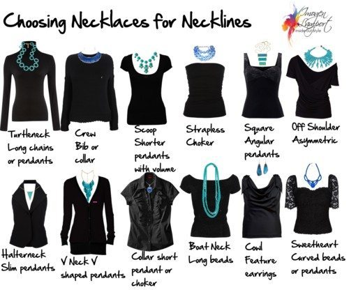
Choosing Necklaces for Necklines

Different necklines look better with certain necklace styles.
 

Turtle necks – best with longer necklaces

Crew necks – best with short necklaces such as necklace ‘collar’ or bib styles

Scoop necks – fill in the space with multiple strands of beads or larger scale pendants

Strapless Рlook great with chokers or short pendants, leaving your lovely d̩colletage bare

Square necks – look for pendants with an angular finish to harmonize with the angular neckline

Asymmetric necklines – look for necklaces that aren’t symmetrical, instead a necklace that has it’s own asymmetry can work, alternatively a long string of different sized and shaped beads can work well.

Halter necks – these create a narrow V neck – so look for a narrow pendant with a sharper end
V neck – ideally a necklace that matches the shape of the V – depending if it’s a wider or narrower V neck.

Collared shirt (button down) – there isn’t much space for anything too wide, so a choker style works if you have a long neck, if not a slimmer pendant that sits above the last open button.
Boat neck – a long string or two of beads is ideal for this neckline.

Cowl neck – this neckline is already detailed and has volume, so either a short and small pendant or a pair of feature earrings instead of a necklace.

Sweetheart Рa curved necklace that has width that will balance the open d̩colletage of this neckline.

 
This great information comes from Imogen Lamport.
I couldn't sleep tonight and was amusing myself by surfing around my Facebook posts and found this posted by my friend Anne Sturdevant.  I just had to back track it and check out where it came from.  Jewelers kind of work backwards.  They create the piece and then are running around trying to figure out what shirt in the closet goes with it.  Or, better yet, I go out shopping for a matching color - Ha! I usually end up copping out and getting a white or a black because I can't find what looks right.
 
Well, Imogen has certainly got my attention She has plenty to say about fashion and finding the right things to complete great looks for your wardrobe.  It takes a bit of doing to shock me but her site managed that easily.  Really, where has this site been all my life while I was struggling to figure out what to wear.
 
Look at that great visual on necklaces!!!!!!!
 
The title of the original post is:
                                         "How to Choose Necklaces to Work with Your Neckline"
                                                  and it's from Imogen's Inside Out Style Blog
 
I really think you will like her blog - I'm totally smitten and am adding it to my Favorite Blogs list.


Wednesday, May 8, 2013

Soldering, anyone?

When I first started soldering there weren't the plethora of videos and books out that there are now.  You had to go the traditional route and attend a class or a school.  If you were lucky you had a friend who could show you.  Rio Grande Jewelry Supply has always been a great resource for information so I thought I'd pass this along.


Monday, May 6, 2013

Progress...


Baby steps, baby steps...but always forward ho!  Pieces to cut and shape for the earrings and  Metalliferous  is out of my favorite wire to bend for earring hoops - poop.  Well, it will just give me plenty of time to do some resin work on these and others.  I even finished a small kiln load of the ceramic bits and pieces.  When it all comes together I'll probably end up with about ten pair and plenty of leftovers for more.

Saturday, May 4, 2013

Leave it to Albert

 
"If a cluttered desk is a sign of a cluttered mind, of what, then is an empty desk a sign?" ~Albert Einstein
 
There couldn't be a better excuse for my "works in progress" mania than that quote.
Thank you Mr. Einstein.

Thursday, May 2, 2013

Components are my "Happy Place"?

I feel like Nemo in my happy spot.  The exception being that nothing is complete.  I'm sure my friends would say that once I actually sit down and start creating a finished piece I certainly won't "want" for anything because all the pieces are in various stages of nearly complete.  You know, a patina here - a resin there.  Making rust on tin and glazing little bits of this and that.  I really think I'm trying to talk myself into the fact that there isn't a room in the house that doesn't have some kind of artistic chemistry going on.  Let me show you....

Clay bead caps and dangles (in progress)

Glazing piles of stuff (in progress).

Patina mania (uh, in progress) so I can resin some paper stampings into them
 
A stack of tins (to be cut up and stored for future use) - oh yeah, the dog has knocked over this pile twice!
 
And this is the tip of the iceberg that is piling up everywhere...kitchen counter, two folding tables in the front room, my end table I didn't even take a picture of - it's full of drawing tablets, paper cut outs for the cabs, bits of stones to wrap.  The list is endless.  Uh, then there is the portable cafeteria tray that has two pair of half finished earrings.  It's like I figured out the puzzle of what worked and stopped.  Gheeze!  Does anyone but me work like this sometimes?  I need something for ADD, I'm sure of it.

And - this doesn't even cover the fact my work table is full - somewhat spilling over.  And, oh yes - there is another and....I need to stop what I am doing and go back to lampworking because I need glass beads to sell at the Glass Act booth at Bead and Button in a month.  Oh puck....who knows a geneticist who can clone me!

Wednesday, May 1, 2013

Class with Jari Sheese

I told you all about being at Portia's but I never really got to rave about our instructor.  I wouldn't rave if it wasn't any good - I'd just kind of keep my mouth shut.  But, there isn't any need to be coy about it - Jari Sheese was a phenomenal teacher.  It would be a shame if she were to retire teaching but that is the word from Jari so if she's taking a break I'd find a place you can sign up for a class and do it fast.

Jari Sheese working a twisted stringer onto a button top.

A great selection of Sheese's Buttons


Did I learn a lot?  You bet.  I'm showing you a photo of Jari's buttons and they are labeled as hers - but she taught us how to do that....they're fun.  As I said in the previous post I had the opportunity to use plenty of Double Helix glass (love that stuff) but what I loved even more was the fact that Jari knows the subtle nuances of using it to it's advantage.  Just about anyone can make it work in an organic bead but it does take someone with great skill to use silvered glasses in a controlled way.  I learned to lay down the glass - reduce it - use stringer work - bring it back out of it's silvered state - lay down more stringer.  I mean, whoa, you can get a lot of looks out one type of glass by knowing when to reduce and what to add to it that will react with it - or not. 

Then - to top it all off we made ornaments.  To look at Jari's ornaments I thought to myself, "Oh hell, there is no way I'm going to be able to make one of these."  But by the time she was done guiding us through the steps and letting the pieces anneal overnight - well, there we all were.... with finished ornaments.  All different and all beautiful.  It takes skill to orchestrate ten students through that process and we all finished.

An ornament by Jari Sheese

We all finished buttons, ornaments, silver glass experiments, pendants, and Jari even showed us how to make her earring drops - and we made those too.  I came home with a ton of techniques and notes for more experiments.  There wasn't a bead in Jari's extensive collection that she couldn't recall the colors used or the order she put them on in. 

Did I have a great time?  Absolutely, and Jari's instruction was a HUGE part of that art retreat experience.  I love having a great teacher at a great studio.  There's not much to go wrong with that equation.

And what did I make in class...plenty.  But I thought I'd show you this since Mary Kay Stout sent me photos of the ornament I took home.  What do you think?